October 14, 2020

While fewer working hours can mean enjoying a shorter day or week at work, the consequences might be unpredictable.
While fewer working hours can mean enjoying a shorter day or week at work, the consequences might be unpredictable.
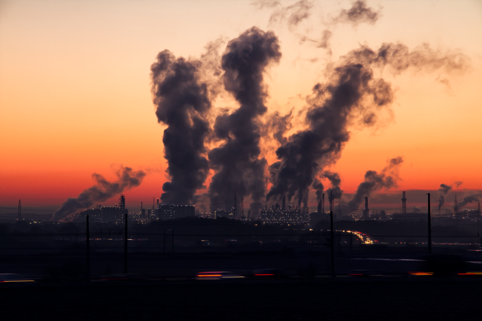
The Lawrence Livermore National Laboratory's annual flow chart is the easy way to see all you want to know about U.S. energy use.
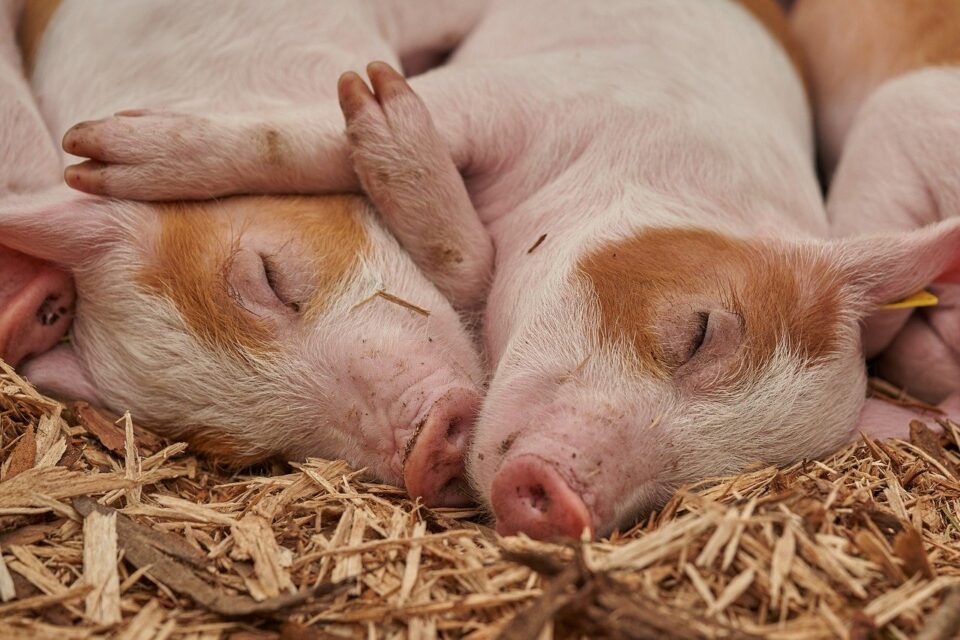
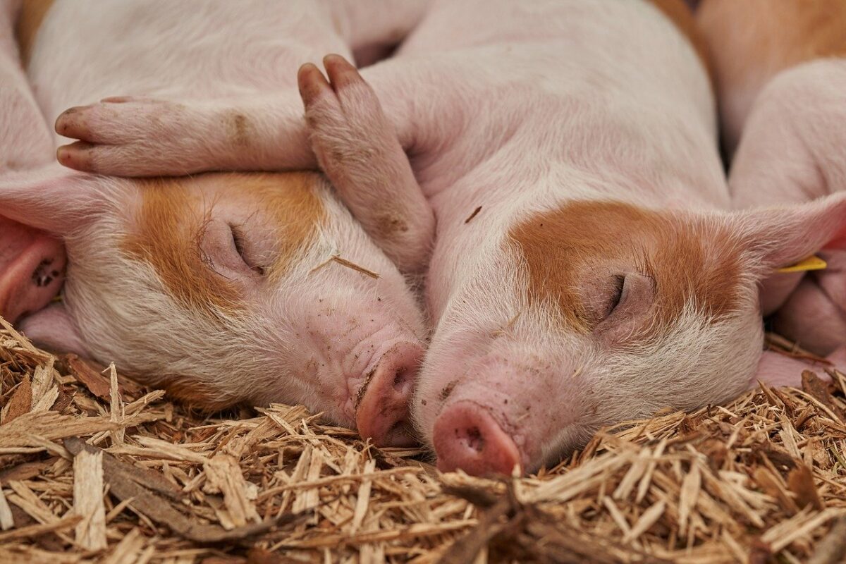
The massive manure pools created by North Carolina's hog farms have many problems that have not been solved.
The massive manure pools created by North Carolina's hog farms have many problems that have not been solved.
Having observed Alaska's Fat Bear Week, we can see the tradeoffs created by a proposed copper and gold mine.
In his new book, climate activist Bjorn Lomborg presents a controversial carbon tax proposal that could remind us of Goldilocks.
The recycling revenue that municipalities were receiving was shrinking and now, with some mystery surrounding cardboard, it's getting worse.
Looking at Cape Town, South Africa and 12 U.S. cities we can see why the basic water tradeoff involves a choice between conservation and affordability.
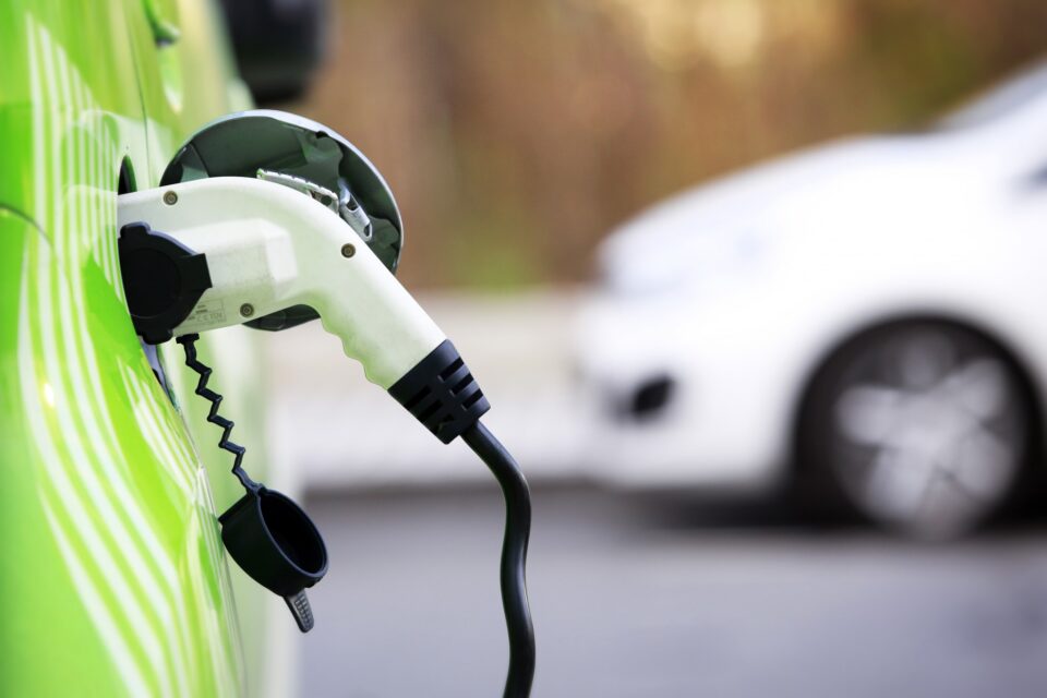
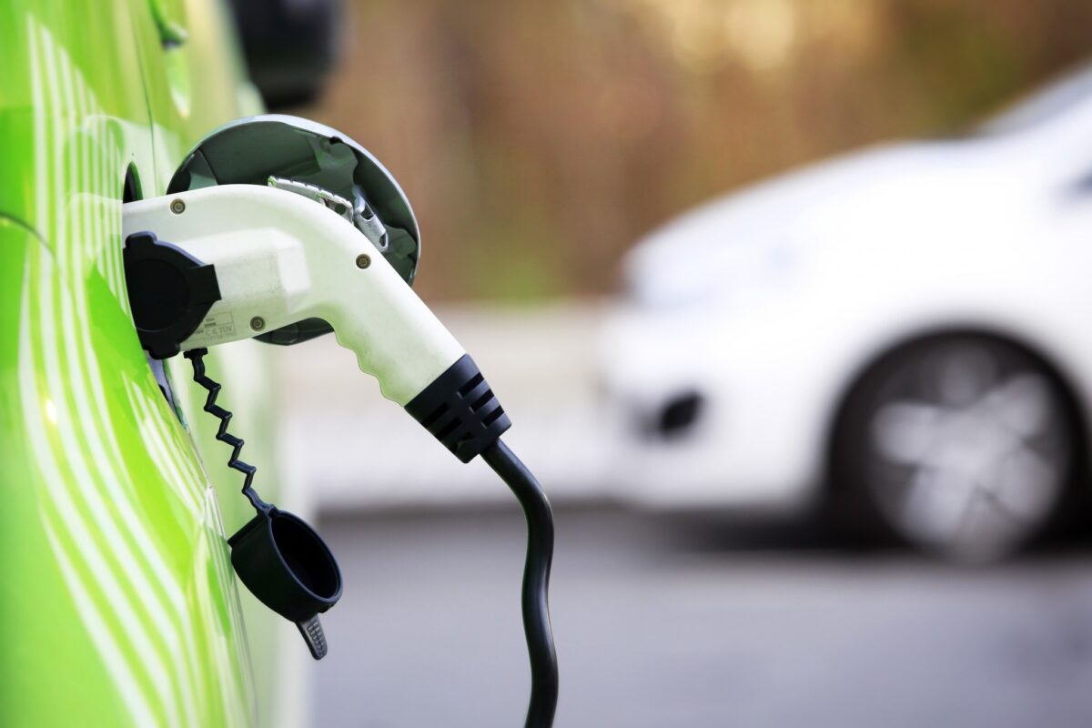
If you care about the emissions created by an electric vehicle, the next step is to think of your zip code and the grid mix in your state.
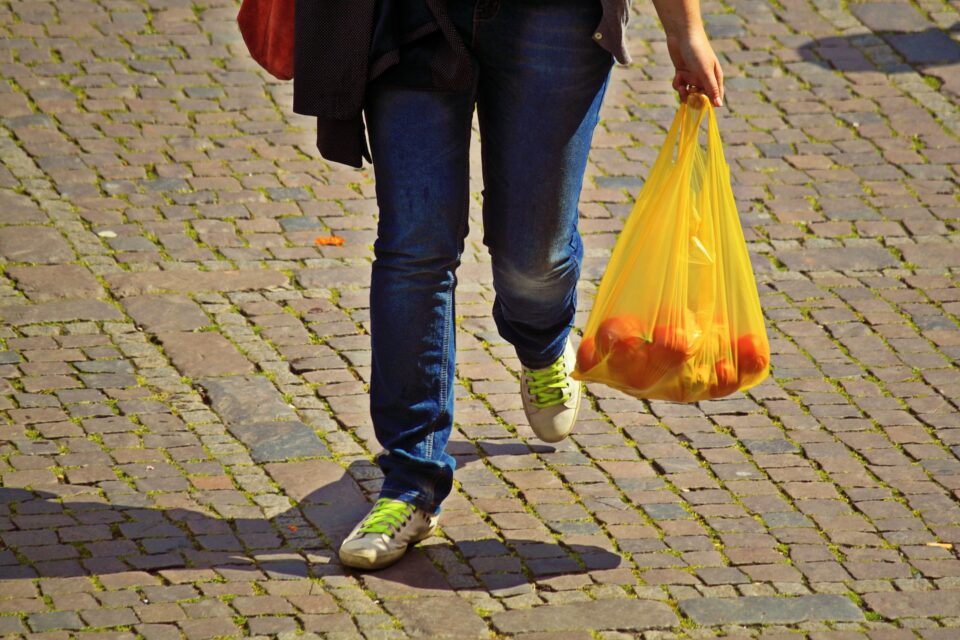
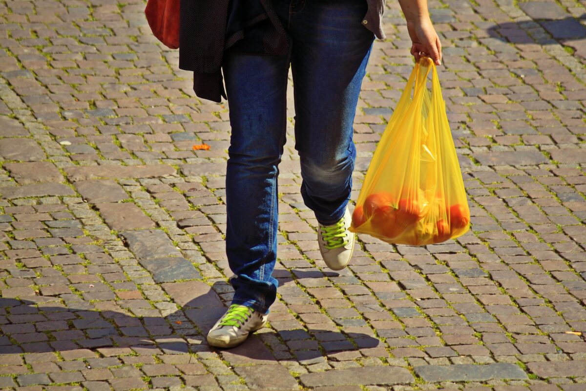
While the wisdom of plastic bag bans have always been debatable, now with the coronavirus pandemic, there is another reason to reverse them.
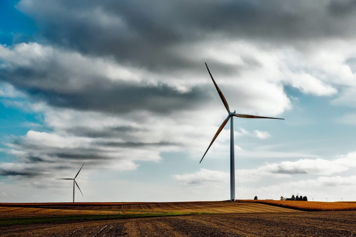
To see where energy comes from and where it goes, we can look at a chart with U.S. energy flows or the alternative energy that is described by xkcd.
Coronavirus can create an economic indicator that tells us whether manufacturing activity has increased or decreased in China.